

The Truss
2024
Solo Project
Design Timeline: 1 month + Ongoing Updates
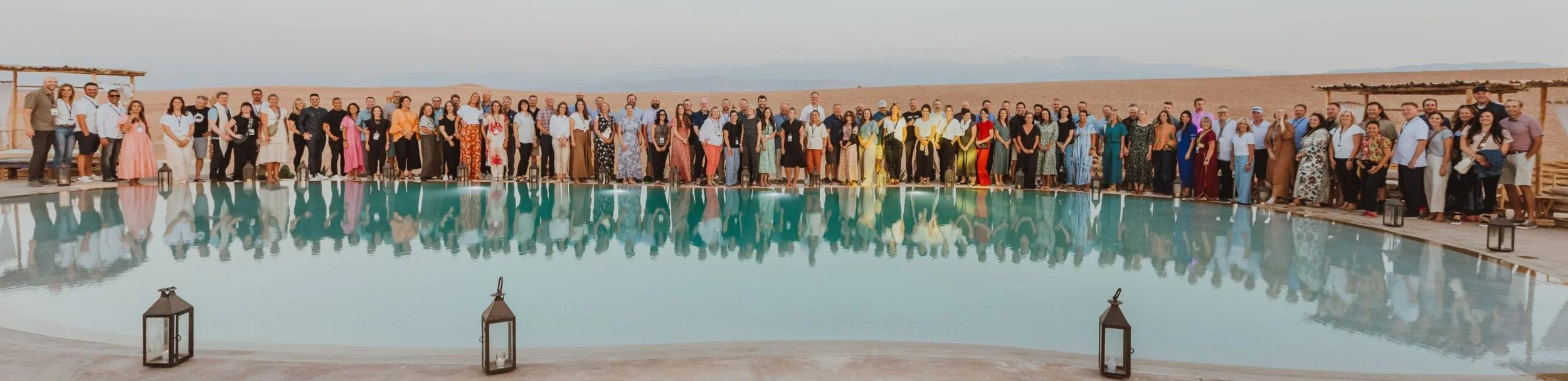
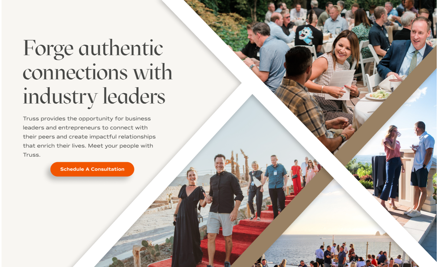
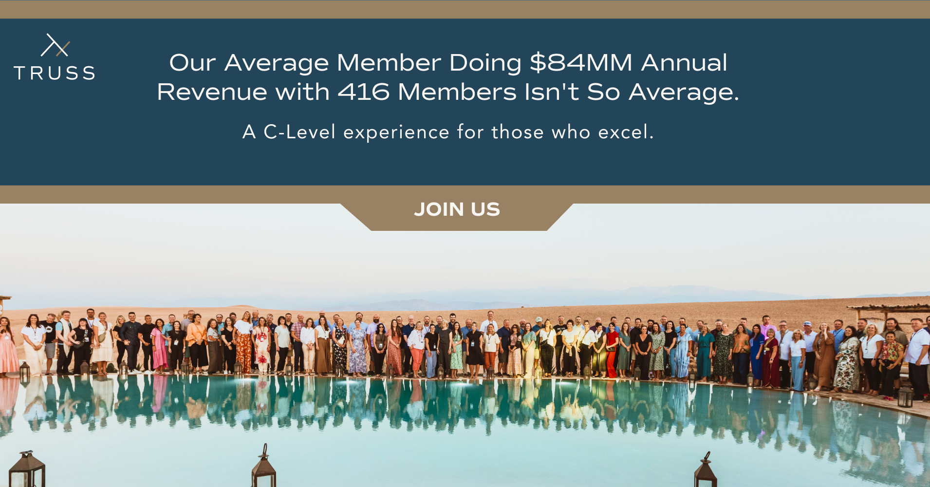
Truss provides the opportunity for business leaders and entrepreneurs to connect with their peers and create impactful relationships. This business group entity creates interactive business opportunities by creating travel environments for members to enjoy and connect outside of office spaces.
Problem:
The Truss site was outdated and in need of refreshing. I was tasked to do a complete rehaul on the design, sitemap, content and marketing assets.
New additions/marketing features:
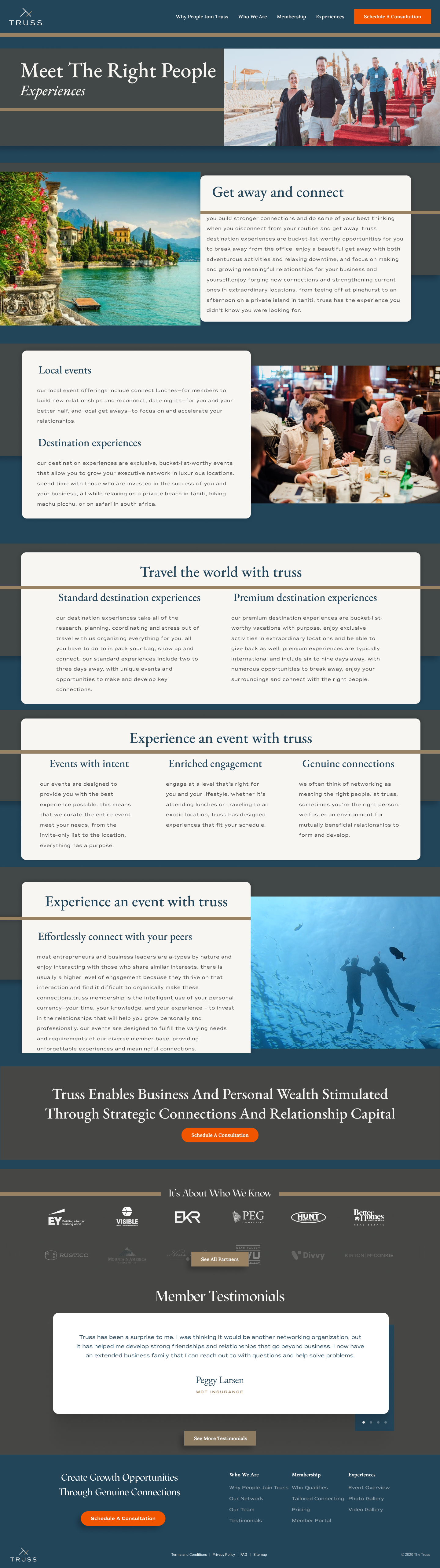
Page - “How Truss Differs”
Animated sliders with content
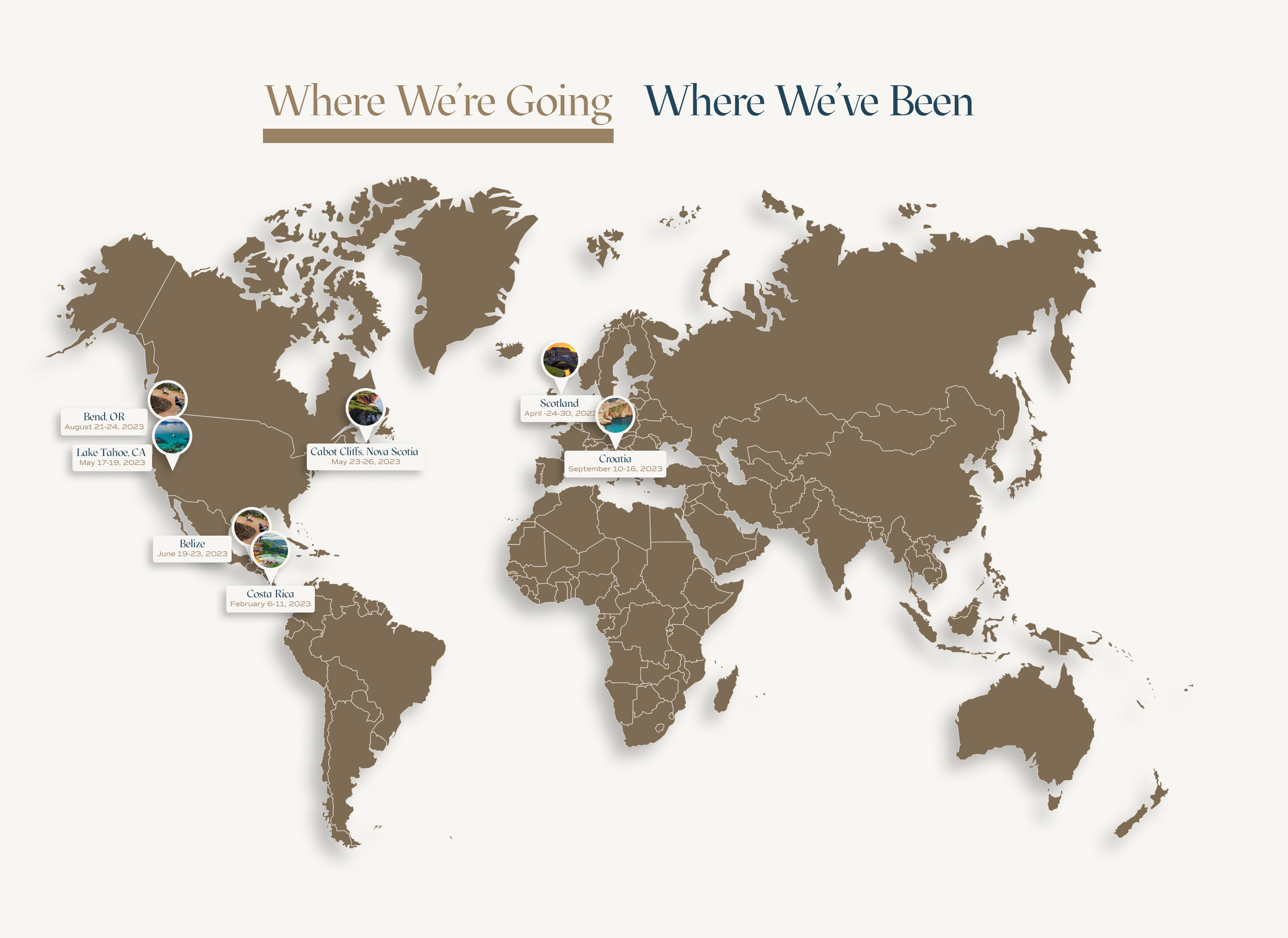
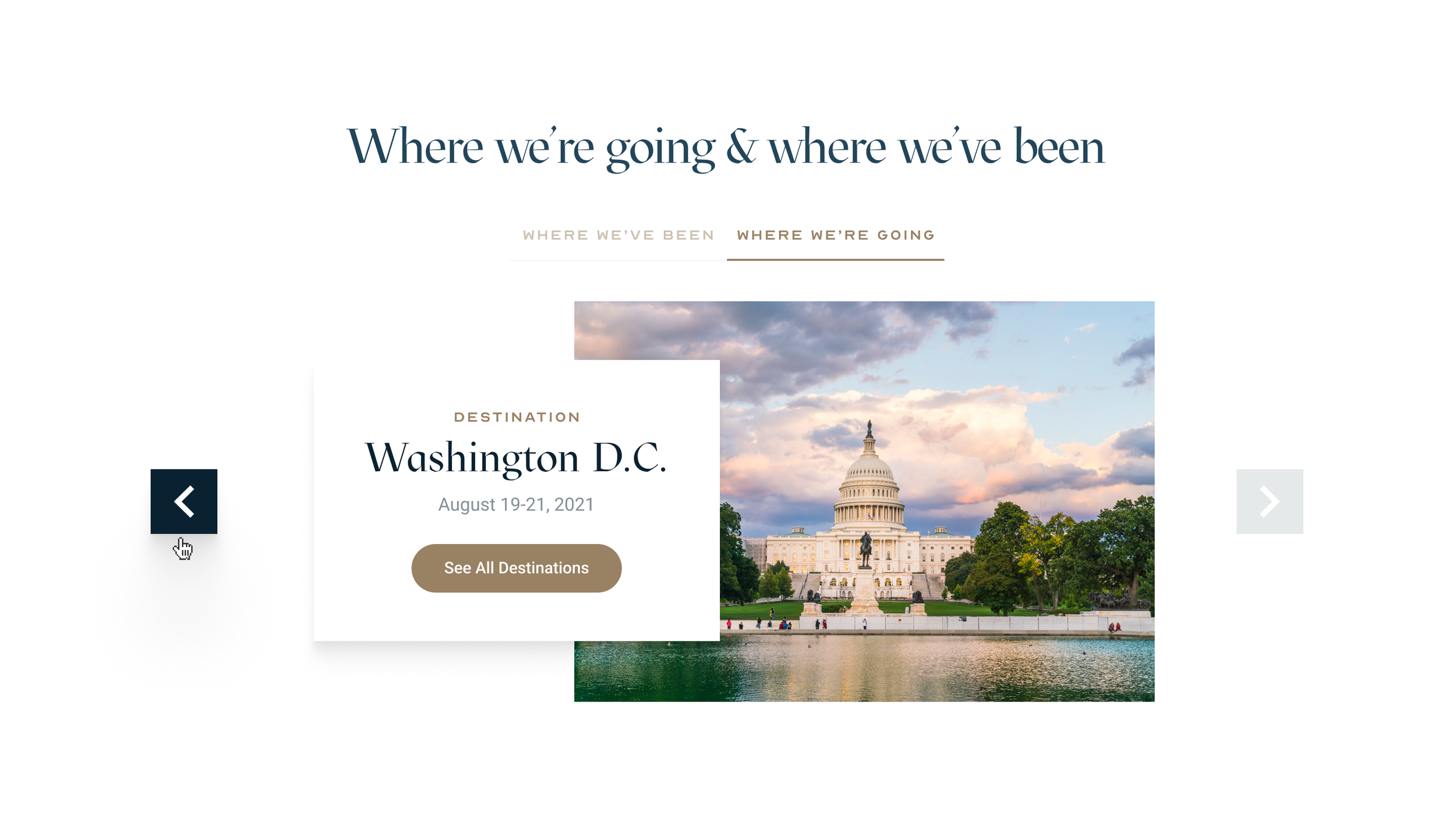
Asset - Interactive map
Role
Product Designer
UX +UI
Graphic Designer
Marketing
Industry
Networking
Travel
Perceived Solutions:
Give the site a new style while also preserving the essence of what Truss means to the stakeholder. Using clean typefaces, bold borders and sharp edges to give the site a strong and structured style.
Develop an interactive map that shows “Where we’ve been” and “Where we’re going” to visualize their travel destinations. This gives users a visual representation of past and future excursions at a click of a button.
Create the “How Truss Differs” page with interesting interactions that meet stakeholder marketing goals.
Design Tools
Figma
Photoshop
Illustrator
Relume
Buzzwords
User Experience
Responsive Design
System Design
Interaction Design
Prototyping
Just want to see the final result?
Check out the current site
PAIN POINTS
1️⃣
THE PROBLEM
1️⃣
PAIN POINTS 1️⃣ THE PROBLEM 1️⃣

Client’s Needs and wants
“We want an update to our website that is inviting and exclusive. the way we operate is completely different from other networking spaces. we take people out of the office and put them in high end experiences that is more organic to our members and those coming into the truss family. ”
Pillar To Post - CEO
The Problem:
Potential member sign ups were low and competition in the space is becoming oversaturated. What can we do to change the voice of Truss and the messaging of why they’re the best multi-millionaire networking club in Utah.
Pain Points:
Lack of new membership sign-ups.
Designs weren’t up to date
Messaging and marketing assets were out dated and needed a new voice.
Need for visibility on social networks and marketing strategy needed to be addressed.
Research
2️⃣
Discovery
2️⃣
Research 2️⃣ Discovery 2️⃣
Understanding Truss and why it differs
My team and I worked together to understand what separates Truss from other competitors.
Why Truss Differs
The Truss “Way”
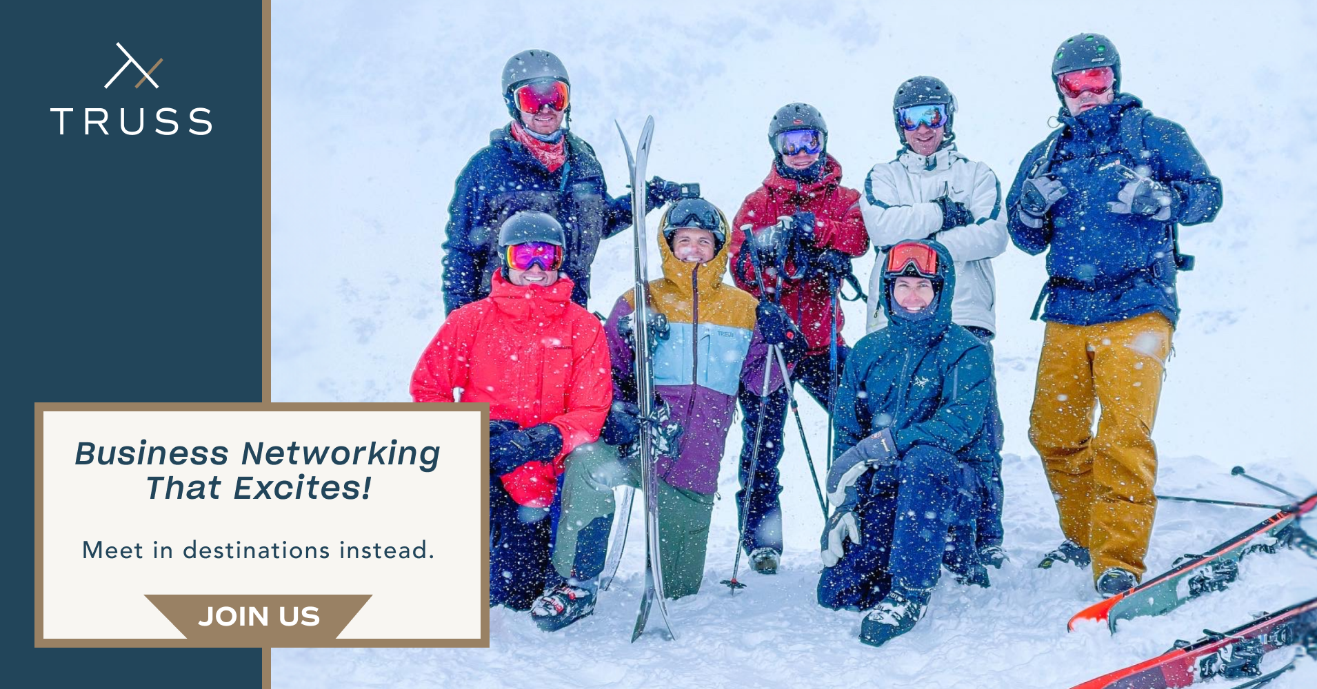
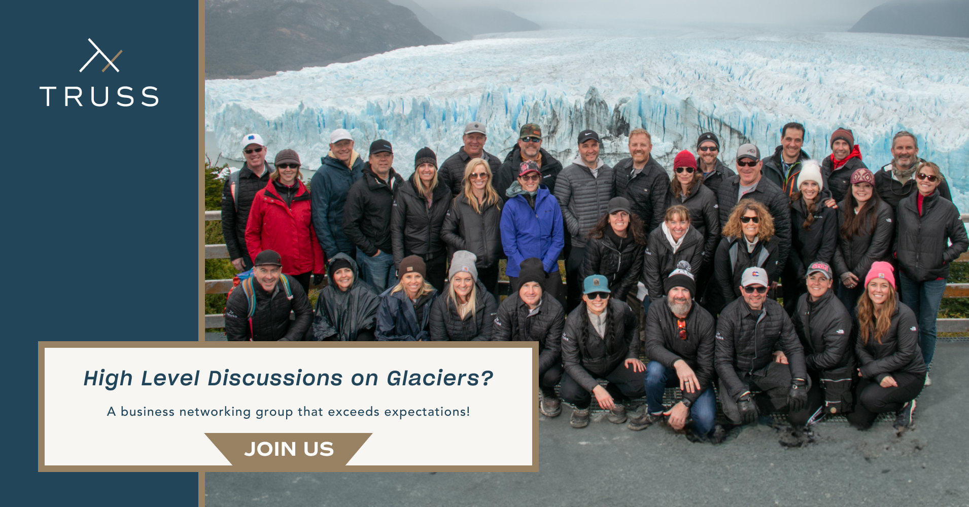
Changing the way you network.
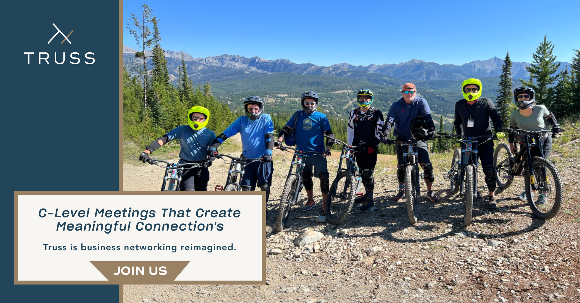
Destination connections :
Instead networking the old school way Truss creates more connection through destinations and activities.
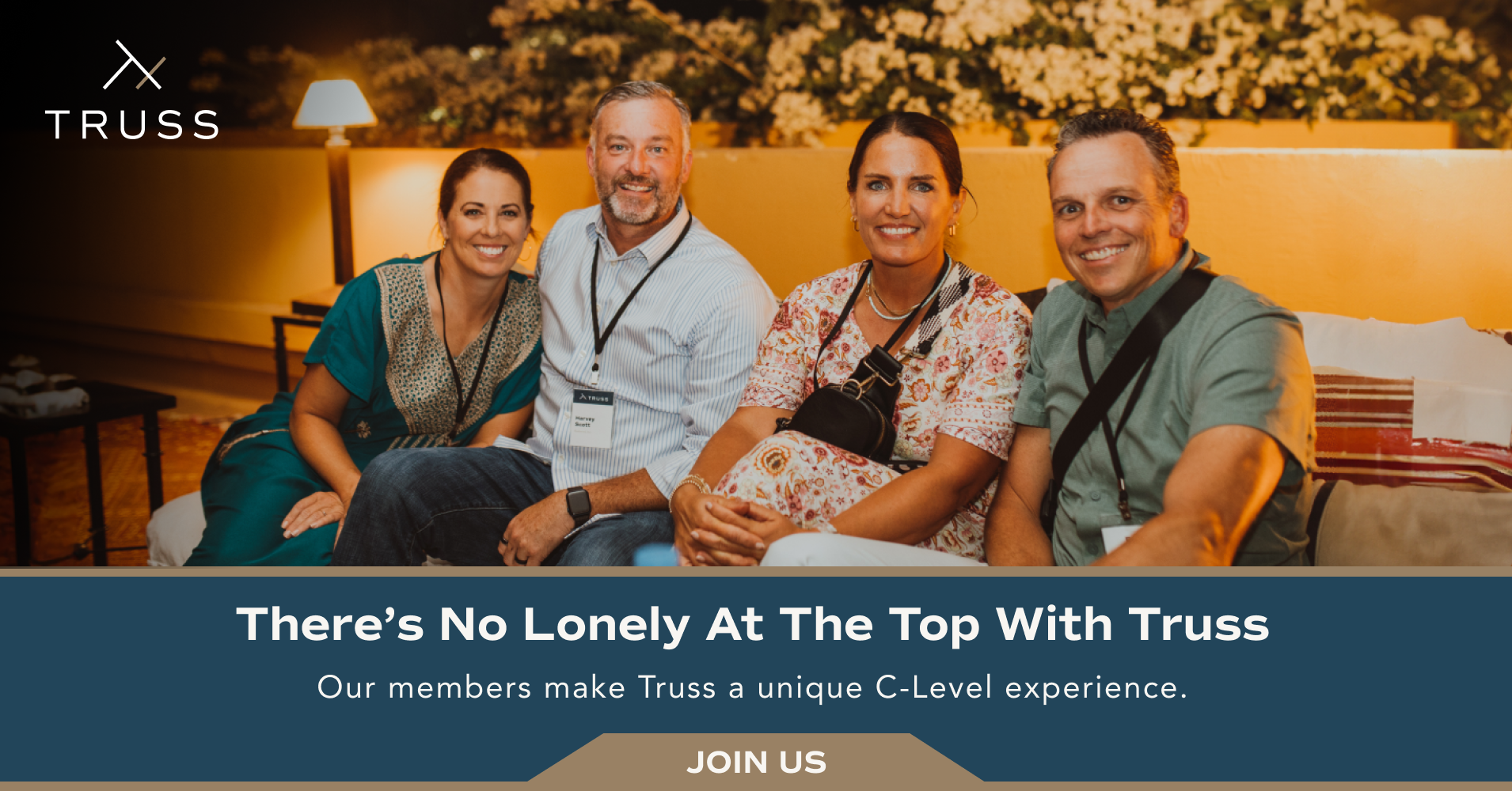
A strong founder and team that caters to to their members
Likeminded members with similar backgrounds to increase relatability and friendship synergy.
Business focused, friendship forward.
Testimonial interviews
“Truss improved my mental health with depression by helping me build connections with people I am happy to call family.”
— Quoted Source
“Having access to all the great people at Truss helped me understand my business goals better and how to achieve them. I grew my business 230%”
— Quoted Source
“I joined Truss to network in a fun and interactive way. I meet a lot of people and it gets very tiresome engaging in the same conversations time in and time out. Truss events are more personal and exciting, it makes networking less intimidating.”
— Quoted Source
Insights
Members want connection over everything.
The members of Truss don’t want to sit in a room or conference hall event anymore. They want interesting and unforgettable experiences.
Guidance is a focus as well as networking.
Persona
3️⃣
Persona 3️⃣
QUALIFICATION LEVELS

Ideation
4️⃣
Ideation 4️⃣
oLd design vs new concept
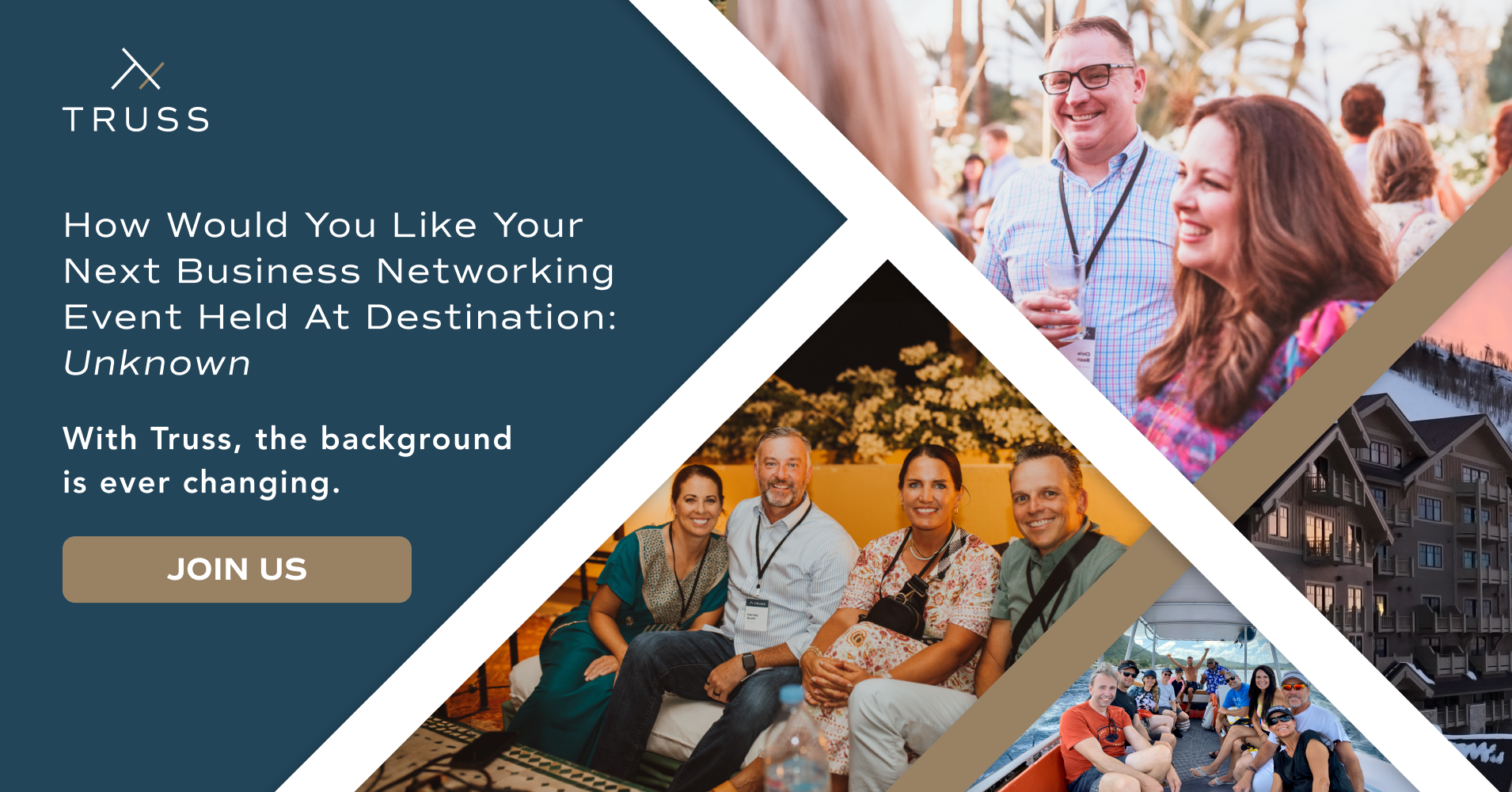
The concept here was to bring life to their hero splash and showcase what they do. In previous interviews with stakeholder they were critical about their brand colors so I made sure to run checks on every color variable to confirm consistency and accuracy.
With the concept design I created a new experience for users using an interactive map showing the past and future Truss trips
Old Design

New concept

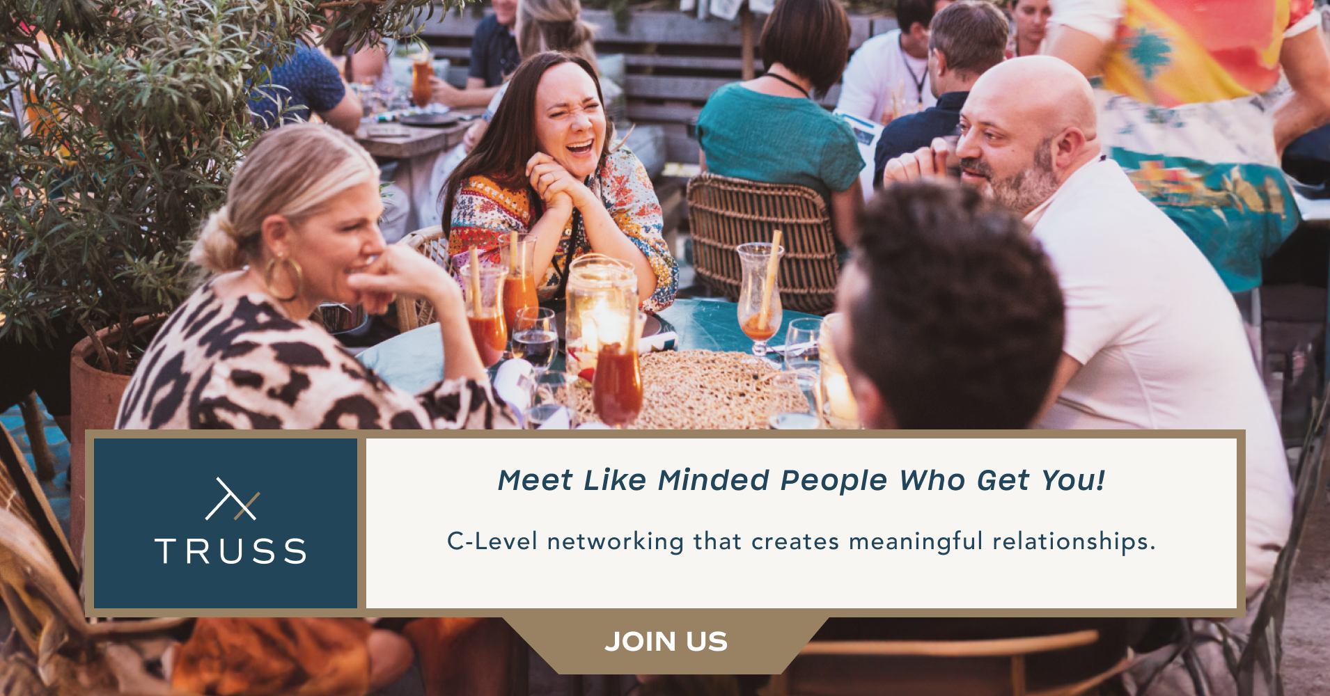
Why Truss Differs Page concept
The idea behind this concept was requested by the marketing team and stakeholder of the company.
How do we differentiate Truss from other networking groups? The answer is by focusing on what Truss does great and why their members love being a part of this organization.
Sliders were implemented showing how other groups function vs Truss. The focus on destination networking conditions and how networking doesn’t have to be a buttoned up experience but a growing experience with like minded people.
ui design
5️⃣
ui design 5️⃣
Here are some style guides

Graphic assets I created for the website and socials

Usability testing
6️⃣
Iterations
6️⃣
Usability testing 6️⃣ Iterations 6️⃣
Edits
The concept design featured textures of gold leaf and marble. Stakeholder reviews showed that they preferred flat colors, while multiple user tests said they liked the textured backgrounds better. I decided to remove the textures contrary to user opinions which is a small concession to make on the overall site design.
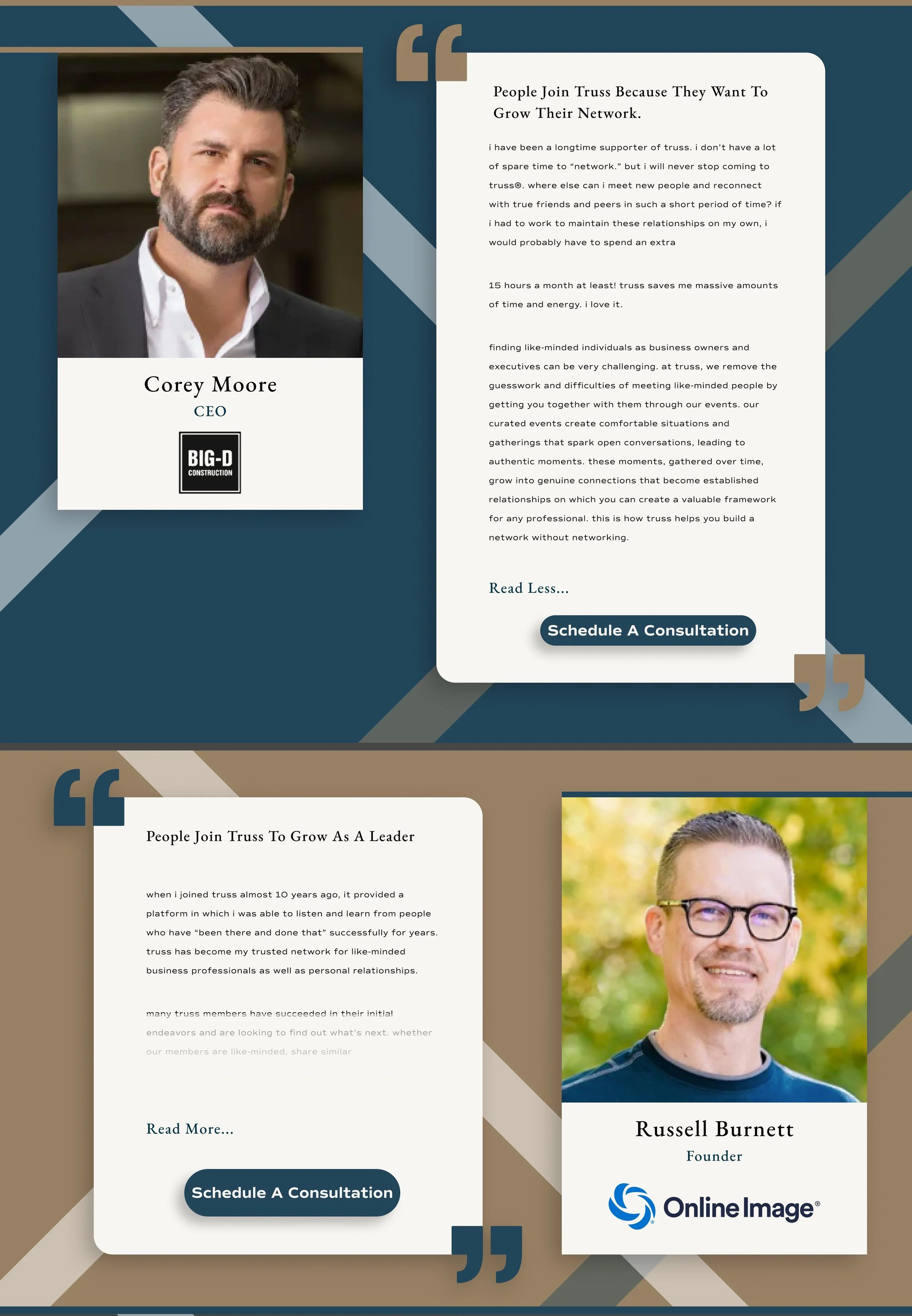
The original design for “Why Join Truss” (left image) were simple cards with quick quotes from their team. After going back and forth with the stakeholder we ended up on expandable bios (right image).
The decision was made to remove another step of clicking “read more” prompting you to another page and give instant insight into the founders and team behind The Truss.
The design of each team member is accented with the Truss logo in the background.
Hover states were added to the map feature to give more interaction.

Final Iteration
7️⃣
Solution
7️⃣
Final Iteration 7️⃣ Solution 7️⃣


Results
•
impact
•
Results • impact •
Increased Membership.
After a year of launching the new redesign Truss reported a 133% membership sign up increase.
Talking with the CEO he said “The design was right on the money.”
SEO showed increased user traffic performance history.
